When it comes to color, we like to turn to nature, our favorite artists or movies for inspiration.
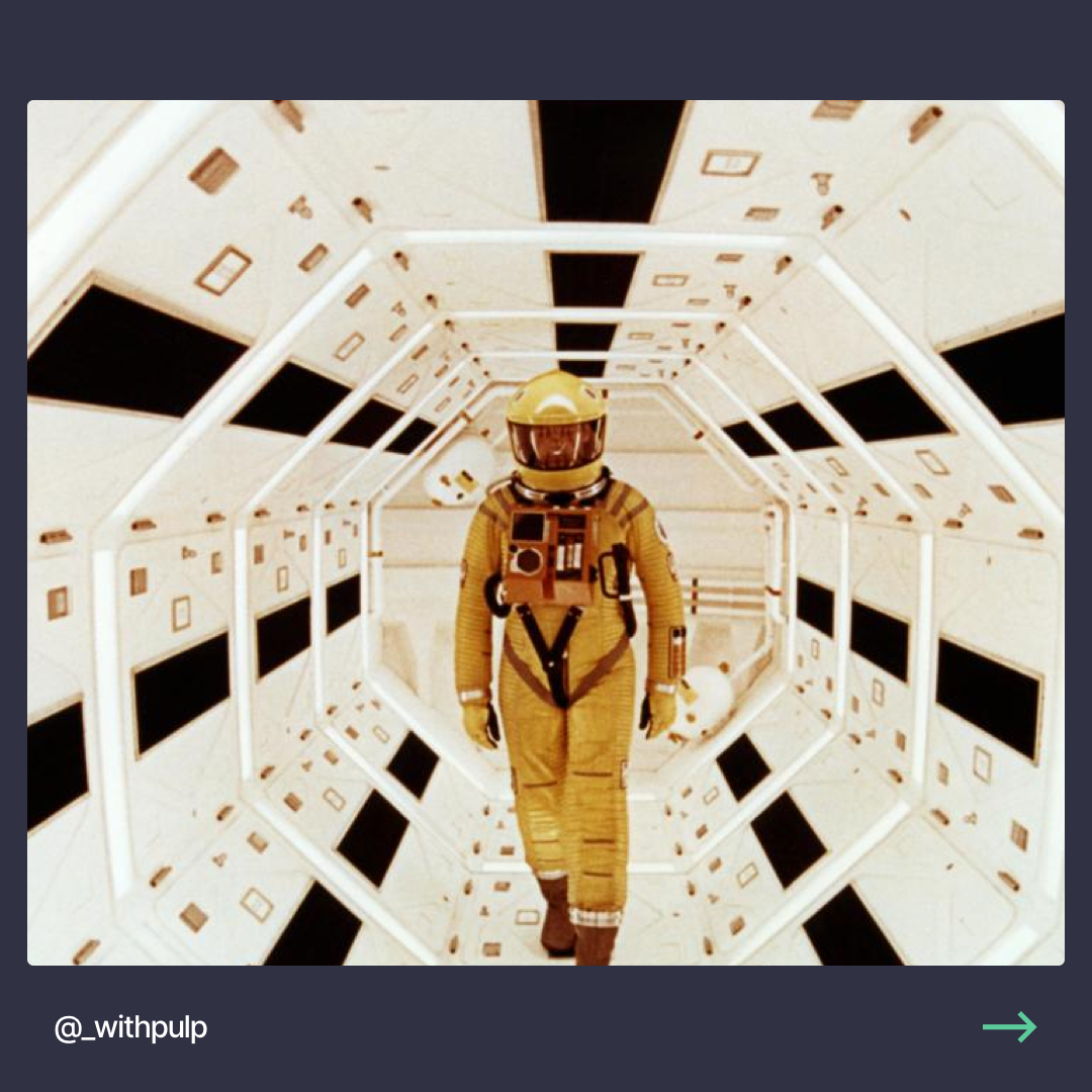
Recently, we did an exploration of the latter by looking at 2001: A Space Odyssey by Stanley Kubric. Here's how we approached this exercise:
- Pick a scene from the movie that we absolutely love for it's visual aesthetic, and we've never seen on an interface before. The second criteria is especially important as it presents a more challenging design opportunity
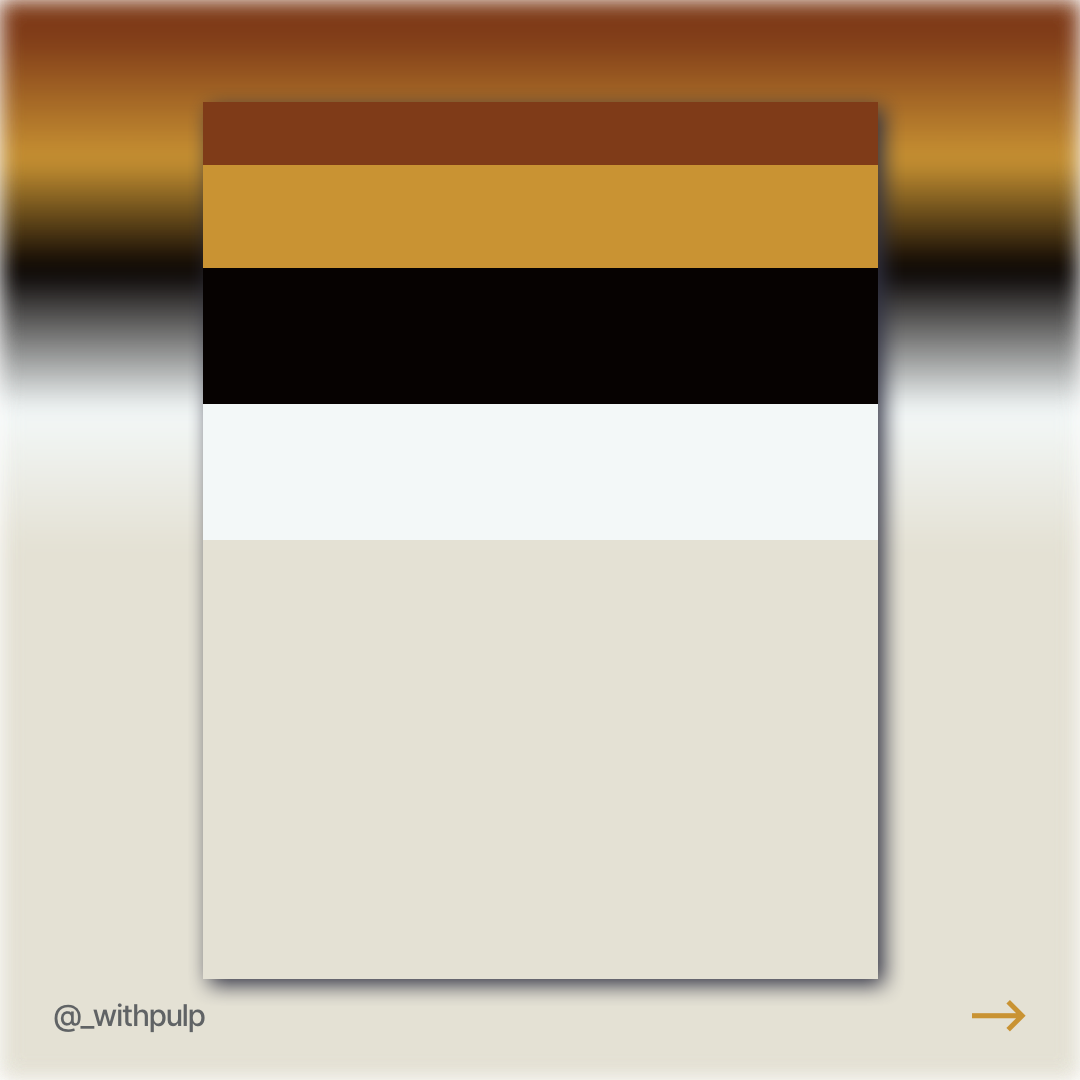
- Extract the key colors and creat a color palette that includes the relative dominance of each color in the palette
- Apply the palette to a practical user interface concept. We like to test palettes with interfaces that we see in the real world as this makes it more apparant whether they work
Here's how it turned out (pulled the images from the carousel post on Instagram):


You can see the full post and others like it on our Instagram: @_withpulp.